MyGriGri
Ever wanted to be more intentional about keeping up with the people in your phone. That’s what GriGri promised to do, and they wanted a site that would highlight the features and help users understand their mission. Here, I’ll highlight some of my favorite components, check out the site in full.
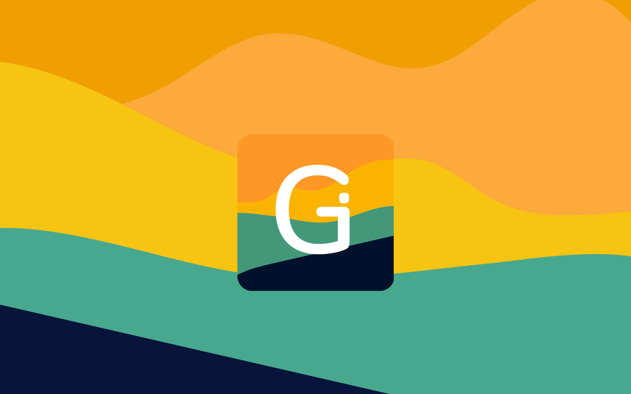
The client came with the app, logo, and other branding, they wanted us to help showcase that made their app so great, and show people why they needed this app. Their logo and app icon featured fun, vibrant colors, with fun shapes and a simple letter-mark. We wanted to take what was already great about their icon and build it out on their site.


We wanted to take the waves in their icon and use them as accents on their site, highlight the playfulness of their app.
We used simplified graphical versions of phones to illustrate what they app was like. Instead of using screenshots from the app, we re-created elements from their app and placed them around the device frame to give it some depth.


We also created an interactive section, where clicking on the highlighted feature, would show the corresponding graphic,. giving the sections a bit of playfulness.
We created a section at the bottom to show all of the fine details of the app, showing how the app goes beyond a normal contacts app.

Check out the website in full, and download the app if you want!