NuMee, Total Wellness Platform
NuMee was a client set out to build a fitness app, with the goal of adding gamification in hopes to encourage users to become more fit and active. In order to secure funding, they needed a proof of concept app, which meant they needed an app designed from the ground up.


One of the gamified aspects of the app was to include group challenges, along with a coach or “practitioner” (an experimental name that didn’t make the cut)) as they called them. The dashboard would show all of the most relevant information regarding that information. At the top would be coins, or some kind of in-app currency, which you could use to purchase things for your avatar. You could also set a status that could be seen by friends, teammates, and coaches. Your profile and the profile of your team would be front and center. Active “quests” or challenges would be right underneath, filtered by priority. Your “XP” as it related to your mental, nutritional, and fitness health would be shown. You would also see important information like when your next upcoming appointment with your coach would be.
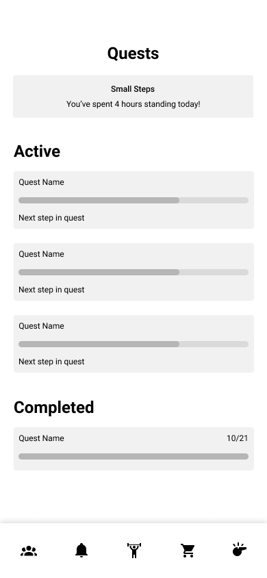
Quests, or challenges, would have its own tab. These quests could range from anything small, like having 6 stand hours in a day, to something like completing a marathon. Completing these challenges would reward the user with in-app currency which would be used in the marketplace for purchasing items for your avatar, or unlocking more quests. This tab would show both active and complete quests, in hope to encourage users to keep going.
Completing challenges would reward the user with in-app currency which would be used in the marketplace tab. The marketplace would offer items for your avatar, or unlocking more quests.
The app was to be tab based, and have 5 main screens; dashboard, quests, marketplace, your profile, and your practitioner’s (trainer) profile.


This is the user’s profile. This tab would display their avatar, as well as relevant statistics, like levels and XP. It would also continue to display the user’s in-app currency level, username, and a button to go to in-app settings.
This is the coach’s profile. This screen would display their name and relevant information such as certifications, specialties, and the ability to access their content or request an appointment. The coach would also have a bio available for users to read.


Here is the high-fidelity version of the dashboard. The client’s color palette included mainly red and blue, with blue being the primary color
Here is the high-fidelity version of the dashboard. We wanted to visualize distinguish between active and completed quests, which regulated in this outcome.
Completing challenges would reward the user with in-app currency which would be used in the marketplace tab. The marketplace would offer items for your avatar, or unlocking more quests.
From here, the client was happy with the overall structure and wanted to go forward with implementing their branding fonts and colors. The next screens were used to visualize the low-fidelity wireframes with their brand colors and fonts.


Here is the high-fidelity version of the user’s profile. At this point we were still trying to decide what avatars would look like, while the client was looking to go for a full 3D render style, but we weren’t sure how that would fit with the look and feel of the overall app.
Here is the high-fidelity version of the coach profile.