This logo project was for the client “Parachute Group”. This is a parent company for several other businesses, and while they already had a letter mark, they wanted something a little more simple for merchandise, and other various digital needs.
Here is the company’s original letter mark, which was used to draw inspiration from. I wanted to play on the idea of a “parachute” for the logo, while also draw from the arc used in the current logo.
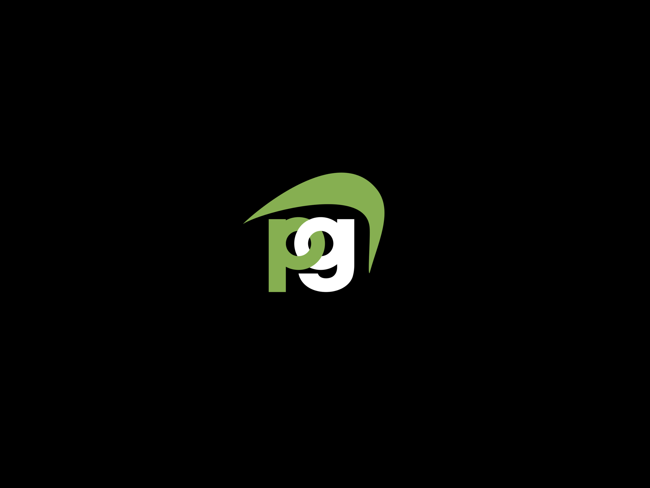
My first idea was to use just the “p” and “g” from Parachute group, to keep it simple but also link the letters together, to symbolize the idea of the “group". This was too simple in my mind, so I wanted to try and add something more to help it stand out. This would be the building blocks for other iterations.

To make the logo stand out more, I worked off the idea of the parachute, incorporating a simple shape which would symbolize the idea. I continued to use the linked “p&g” letters to emphasize the group aspect.

Lastly, I wanted to create something new, while keeping something familiar from the original lettermark. This is where I continued the linked “p&g” letters, while adding a similar arc from the original logo.

